I love when Steven Garrity writes about car stuff because it gets me to write about car stuff too. Yesterday he wrote a post about the license plates of Prince Edward Island, and I love license plates, so I’m going to parrot him again and share my own, local experience and perspective. (Update: Kottke posted about license plates today, too, just hours after me. Remember when this kind of blog post virality was a thing?)
Seriously: I love license plates. I think they’re endlessly interesting and amusing. Growing up, I played the license plate game for years on family vacations, looking for every U.S. state (Montana was my last). I got to know styles, variants, and updates for all of America, and the plates for eastern Canada, too. Growing up, I hated my local plates, so I tried to design my own (more on that later). I read—past and present tense—license plates as I go by, looking for catchy phrases and humor; I know by alphanumeric sequence which plates in my home state are the newest; I bristle at the new trend of defacing a plate to avoid tickets and tolls—in part on ethical grounds, and in part because it takes away some of my fun.
For better or worse, I have passed on this fixation to my younger son, who constantly tells me about what he sees, although he’s more about the logical order and less about finding words where there aren’t any. We do both enjoy a well done custom plate.
Anyway, Garrity’s post was about the recent history of PEI’s license plates, so let me discuss my own. I grew up in New Jersey, and when I was a little kid, they all looked like this:
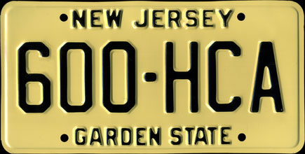
They weren’t much to look at, but they get high functional marks, with their high contrast making them easy to read. (I recall at one point learning about how plates’ readability correlates to cops’ ability to recover stolen cars.)
Soon after I started paying attenion, the Jersey plates got redesigned. The state added a New Jersey silhouette to the profile, replacing the center dot, but they inverted the color scheme, and came up with this cringe-worthy style:
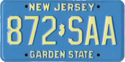
Apparently “blue and buff” is a thing to New Jersey, but it makes for an awful license plate. Readability certainly took a hit with this style. And the overall effect was just unattractive.
I had an Apple //c computer growing up, and around 1987 I went so far as to redesign the New Jersey license plate in Dazzle Draw. (Why I didn’t draw it freehand, I do not know.) I played up the Garden State angle, with a Jersey Tomato, and leveraged the Jersey Devil and the new hockey team’s color scheme, making a design with a white background and green-and-red visual elements. I sent two variations with a note to Governor Tom Kean’s office. I’m sure it looked pixelated and awful, but I bet it wasn’t any worse than the blue and buff license plate. The governor’s office did not respond.
By 1993, I had gotten a new car, and New Jersey had updated its license plates again, so mine looked like this:

Readability was back, and the design was both retro and modern with its color fade, but what was this design? We’re giving up on “buff and blue”? The nice state stamp in between the letters stuck around, but in an era when other states’ license plates were increasingly attractive and clever, Jersey got a plate that met outsiders’ low expectations. With minor tweaks, this design persists to present day, thirty years of uninspired license plates on the Garden State Parkway.
Meanwhile, New York was pulling ahead. My childhood memories of New York plates were of the color and then the Statue of Liberty, which were fine—not exciting, but somehow more stately, interesting and important than New Jersey. Like the state and its namesake city, New York’s license plates (like California’s) had some presence, and it suited them.
.png)
In 2001, New York redesigned its license plates to showcase more of the state, and they nailed it.
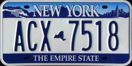
This plate brought lots of good elements together: the state outline divider, the slogan, and a collage of statewide geographic features across the top, from Niagara Falls to the Adirondacks to the Manhattan skyline. It was handsome, easy to read, interesting and memorable. A great license plate.
My car at the time was registered in New Jersey, so I missed having that license plate on my vehicle. By the time I got a new car, in 2015, New York had moved back to the orange-and-navy theme of the 1970s, ditching the geographic elements, which were beginning to seem fussy, in favor of a simple, clean layout.

This design was… fine. Easy to read, plays off the past, curved lines and fonts give it some style, the shade of orange matched the NYC taxicab fleet pretty well. I didn’t love it, but there was nothing to dislike, either.
The same cannot be said of the current New York plates, which adorn my car now. They are emblematic of much of the Andrew Cuomo administration: well-intentioned, earnest, but failing to stick the landing.
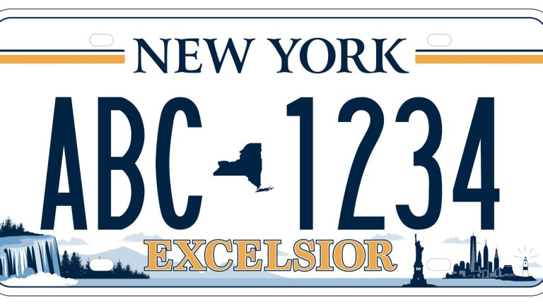
We are back to the previous geographic elements—all of them! Plus the Statue of Liberty returns, and now there’s a lighthouse, and some clouds. “Empire State” has been sacrificed for EXCELSIOR, which Cuomo loved to use, presented in an overly bold and blocky font, while the stripes atop the plate fall at an odd height and fail to tie the design together. The overall effect is amateurish. Kind of like something a middle school student would design at home, only this time it’s on every new license plate in the state.
Governor Kathy Hochul hasn’t expressed much concern over the current New York license plate, which is just three years old, but perhaps her successor will. Maybe we’ll get something inspired for the next decade. At least the current plates are easy to read. Excelsior.