Blogging since 1998. By David Wertheimer

Category: business (Page 5 of 6)

Duane Reade, testing customer loyalty

From my post on aiaio:

The new program is more confusing and far less valuable. Consumers now get two points per dollar spent and the same $5 reward now comes at 500 points. Or, in layman’s terms, after $250 spent rather than $100. Earning the five bucks just became two and a half times as difficult.

My wife and I probably spend around $1000 a year at Duane Reade. With our normal memory patterns (read Amy doesn’t use the loyalty card very often) we got $40 in store credit last year, and were eligible for $50: not bad for just showing up. Now that $1000 spend is worth just $20 in reward dollars, or $10-15 when we factor in the days we forget to use the card.
Ten bucks a year is below my worth-the-trouble threshold, so I’m basically done with the rewards card. I wonder how much less I’ll look to DR as my default convenience store as a result.

Why the Nexus One isn’t exciting

From my post on aiaio:

In partnering with HTC, a company that produces cell phones for every US carrier and two different operating systems, Google ceded control of the overall experience. Never mind that the handset is slim and fairly attractive. It’s also generic, and apparently imperfect. When David Pogue pushes your phone’s home button, you really don’t want it to fail.

There’s a huge difference between designing and engineering a device, as Apple did with the iPhone and Palm with the Pre, and a company having a device “built to its specifications”. Google was telling HTC, “We want our phone to do this,” and HTC was putting the requisite componentry in place. This tends to minimize holistic product definition and by its very nature waters down the innovation. In contrast, Palm and Apple (and Motorola and Nokia, for that matter) manage the entire process, and their software is designed to complement the hardware, maximizing user experience. Google, a company that is strictly virtual, doesn’t know how to do this.

Apple completely reengineered the UI of mobile telephony with the iPhone. Visual voice mail. Screen-based keyboard. Multi-touch interface. The list goes on and on. Google, in contrast, is very “me too” at this point in its phone development cycle. It will be interesting to see if Google follows the Microsoft model and finds nirvana in its third or fourth release.

On taste

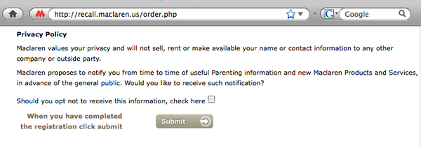
Maclaren is recalling a million strollers after receiving 12 reports of children slicing off part of their fingers in the side hinges of numerous models.
The recall form for ordering new hinge covers is online. The last item in the form is an opt-out to avoid joining the Maclaren email marketing database. Oh my.
maclarenform.png

Everything old is new again: Facebook and AOL

Steve Rubel: Five Incredibly Useful Things You Can Do Without Ever Leaving Facebook. “I am discovering that it’s becoming a one-stop shop for many of my day-to-day activities,” he writes.
The post strikes me as a retrograde observation. Not because Steve Rubel is any kind of Luddite, but because the online industry has, for more than 20 years, been trying to create a one-size-fits-all website. It still is. Indeed, it seems every big site aims to recapture the glory days of America Online.
In the 1980s, Compuserve and Prodigy and the like created online dialup communities. The winner in this space, of course, was AOL, which dominated for years. It became a destination for users and businesses alike. Every company in America needed an AOL presence and someone who could code in Rainman.
As the web’s ubiquity overtook AOL, websites began cropping up that attempted to reinvent the paradigm by … emulating AOL. Yahoo and MSN (and many smaller peers) created integrated online presences where features and options abounded and stickiness became the prime measurement.
Then search came to prominence and splintered people’s site use. Google’s success as an ad platform allowed Google Labs to create dozens of experimental services, all of which served to make Google more of a catch-all, and more like … the old, closed-wall AOL, just with outbound links.
Which brings us to 2009, where Facebook has captured the exact same mindspace as, yep, AOL. What makes Facebook interesting these days? Basically the same things that made AOL a star a decade earlier.

  • private messaging without an external email client: just like AOL!
  • live chat: just like AOL!
  • integrated games and shopping: just like AOL!
  • every company feels a need to be there: just like AOL!

And here we are again, with consumers converging on a single site and companies clamoring to capture their attention.
AOL was eventually done in by a lack of openness and charging for options that were free elsewhere. So far, Facebook has avoided those mistakes. It will be interesting to see what social and economic forces drive its future–and whether it ultimately becomes something other than The Next AOL.
This is a cross-post from aiaio.
Knowing your audience

The little coffee shop on West 21st Street has, dangling under its potato chip rack, a row of flip-flops.
I pointed to them today as I bought my pretzels. “Sell a lot of flip-flops?” I asked the owner, an affable woman who’s always manning the register.
“You know, we open sometimes on Saturday nights, when the weather’s cool,” she explained to me. “And all the clubs around here, they don’t let women in wearing flats. So all these girls come out after wearing their heels all night, and they say to me, ‘Do you have flip-flops? I’d pay anything for a pair of flip-flops!’
“So, we got some flip-flops. I know how they feel–I once spent $20 on flip-flops after a night like that. But they’re all college girls, you know? I don’t want to rip them off, so I just charge five dollars.”
Have your customers voiced unexpected needs to you? How are you solving their problems?
This is a cross-post from aiaio.

Pronounced “Baw-st’n”

As mentioned on the business end of things, I’m in Boston at the Internet Retailer Conference & Expo, culminating in my presenting at the conference Wednesday afternoon. It’s great to be back in town–with the exception of a six-hour business meeting in January, I haven’t spent any time in Beantown in nearly a decade. We took advantage tonight, eating at a local restaurant in the North End, and I have plans to see at least one old friend before I leave town.
Massachusetts always strikes a great note with me. The history, the architecture, the weather: everything is the way I like it. A lifetime of summer visits to Cape Ann (and, more recently, Martha’s Vineyard) has certainly influenced me. And even though I’m a Yankee fan in the Red Sox’s backyard, it just feels good to be here.

Tropicana feels it where it counts

In the wake of Tropicana’s disastrous rebranding over the winter, its sales plummeted 20 percent in six weeks. Twenty percent in six weeks!
That’s a disaster on a monumental scale for a brand this size–$33 million in lost sales, plus the millions of dollars in designing, packaging and marketing the new designs, and the funds to clean up the mess.
The sales news also sheds new light on the decision to switch the packaging back, which at the time was called a “deep emotional bond” among Tropicana consumers. Indeed, the exact opposite was true: without the logo, people assumed their juice was gone, and simply bought something else. Neil Campbell, call your public relations department. (via kottke.org and df)

On landing a job

How to Get Hired on aiaio, the Ai blog.
I have long been an observer, commentator and course-corrector when it comes to job interviews. Many moons ago I published a series of job-hunt best practices in this space. Titled “Interdon’t,” many of my pointers are just as relevant today as they were a decade ago.
I am continually amazed by the flagrant violations of basic job-search protocol. Among the things I’ve seen the past two weeks:

  • Cover letters with our company name in a different font, copy-pasted
  • Saying “this position is a great fit” while having a background in, say, high finance
  • Chatty letters with no resumes attached
  • Emailed resumes with no accompanying text at all

People expect to (and do) land work like this? How? I suppose they’re hired by people with similar approaches, but that’s not me.
Anyway, read the two links above if you’re looking for a job, and good luck in your search.

Tropicana and branding

I have been complaining in this space for several months about the awful redesign of Tropicana’s packaging. It screamed change for change’s sake, and truly felt designed without regard for brand strength or visibility.
Old and new Tropicana cartonsWho at Pepsi possibly thought 12-point sans-serif product descriptions were better than the large, color-coordinated pulp and acidity indicators? Or that a sea of orange juice was more eye-catching and unique than fruit with straws? Or that Tropicana’s logo just had to be updated? The new stuff was pretty, sure, but entirely generic and unusable.
Tropicana wisely backtracked this weekend and is reverting to its old packaging. The company cited consumer feedback as the driver, which is nice to see. But its spin completely missed the point.
“We underestimated the deep emotional bond,” said Tropicana’s president, Neil Campbell. “What we didn’t get was the passion this very loyal small group of consumers have.”
This is false. As a loyal Tropicana buyer, I don’t love the straw-punctured fruit or the old logo at all. What I love is Tropicana juice. And the new packaging made it hard for me to buy it. My preference was hidden in small type; the cartons no longer differentiated on the shelves. It took me longer to shop, and twice this winter I went home with the wrong juice. I’m glad they’re reverting but not for the reasons they see (or admit).
One thing hasn’t changed, though: Tropicana Pure Premium is great orange juice. Thank goodness they didn’t mess with that.

« Older posts Newer posts »

Ideapad © 1998–2024 David Wertheimer. All rights reserved.