Main

June 3, 2010

On AT&T's new data tethering

For all the fuss about AT&T's new data rates (both pragmatically good and knee-jerk bad) the main point to keep in mind is whether those rates are actually good for consumers. For the most part, they are: John Gruber notes in his post that 98% of AT&T's users fall below the new 2GB monthly plan, and that even with overages these rates beat the competition.

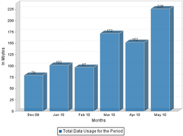
datausage.pngI'm a daily, heavy user of data on my iPhone 3GS, so I logged into my phone bill to see where I land. And lo, a surprise: not only do I not need unlimited data, I can actually drop down to the 250MB plan. Because I regularly use my home and work wifi, and I don't download much media, my 3G bandwidth usage has been 230MB or less for the past six months.

I like the idea of an open meter, and when I change plans, I'll probably switch to the 2GB/month plan, even if it costs me a few bucks extra. I will be happier paying $25/month and never hitting my limit than paying $15/month and worrying about, or getting slapped with, overages when I download some videos. Still, that's found money for me, and for 98% of AT&T's smartphone users.

One could gripe all day about AT&T's signal strength or its needlessly expensive text messaging plans. But its data plans are well considered and decently consumer-friendly, no matter how the blogosphere reacts.

February 15, 2010

The ROI of UX: Continental Airlines

From my post on aiaio:

Yes, there are premium seats available; no, you can't have them. I asked if I could pay extra to reserve those seats: no. I asked if I could get a seat assignment, any seat assignment, so I knew I would make it on the plane: no. I eventually gave up my attempts to cajole customer service into helping me, and after a few hours of deliberation, I took my business elsewhere.

My story isn't all that uncommon, but it still strikes me as a miss on Continental's part. Why must they hold a random middle seat for an unbooked elite member, thereby denying a paying customer a chance to confirm travel?

Between this and Continental's other discomforts—a small 31" seat pitch in coach; 60,000 miles to book coach-class reward travel—I haven't flown CO in more than five years. In the interim I've been on American, JetBlue, Virgin Atlantic, Northwest, Alitalia, Midwest, US Airways, United and Virgin America, and I've enjoyed all of them more than I enjoy my typical interaction with Continental. (Well, maybe not Alitalia.)

January 16, 2010

Duane Reade, testing customer loyalty

From my post on aiaio:

The new program is more confusing and far less valuable. Consumers now get two points per dollar spent and the same $5 reward now comes at 500 points. Or, in layman's terms, after $250 spent rather than $100. Earning the five bucks just became two and a half times as difficult.
My wife and I probably spend around $1000 a year at Duane Reade. With our normal memory patterns (read Amy doesn't use the loyalty card very often) we got $40 in store credit last year, and were eligible for $50: not bad for just showing up. Now that $1000 spend is worth just $20 in reward dollars, or $10-15 when we factor in the days we forget to use the card.

Ten bucks a year is below my worth-the-trouble threshold, so I'm basically done with the rewards card. I wonder how much less I'll look to DR as my default convenience store as a result.

December 22, 2009

UX Critic: Time Warner Cable DVR

Earlier this fall, Time Warner Cable introduced a grand new interface for its digital cable offering. But in its efforts to add features and visual flair, Time Warner Cable managed to worsen many of the features that previously made its system so easy to use.

TWC began by breaking some of the functionality. Not all of it, but enough of the essentials to drive one crazy.

Like the screensaver, for example: on my unit, at least, the blackout that kicks in after pausing for 15 minutes doesn't actually black out the sidebars beyond the 4:3 screen width. Oops. Good thing I don't have a burn-in-susceptible plasma TV.

Or the rewind, which, on higher speeds, snaps forward when play is pressed. Forward! Why? I find my self re-rewinding over and over again.

Worst of all is the 10-second back button, which used to be my single favorite feature on the old TWC remote. Missed a sentence? Pop! Hear it again. Click twice to create an at-home instant replay during a sports broadcast; click three times to watch a commercial from the beginning.

For some reason, this button, while still jumping backward, no longer does smooth 10-second increments. Often, the first click only runs back two or three seconds, which is basically useless. Press twice and the system picks what feels like an arbitrary jump-back interval. It's now almost impossible to pinpoint a moment during playback without rewinding past it and waiting--not horrible in and of itself, but the system used to be perfect.

The list goes on. There's no more "view this channel now" button in the program guide. No option to view extended program descriptions while in the DVR. Even the movie listings were rejiggered, so that the star ratings systems and year of release were moved to the end of the one-line summary, and directors are no longer mentioned.

Of course, TWC didn't set out to break things; the company was trying to add features. But here, too, unnecessary problems were created. Introducing features into the current structure means rethinking the user interfaces, and not always for the better.

I was a huge fan of Time Warner's old font face, which was narrow but easy to read (unlike, say, Adelphia's narrow, non-anti-aliased displays). On the new TWC system, the fonts have been replaced with a more contemporary, wide font. It's harder to read at a distance, and the increased width means program names cut off much sooner in lists.

On-screen cues that used to be straightforward have gotten more confusing, not less. TWC's progressive rewind and fast-forward used to show an increasing number of arrows: >> >>> >>>>. Now, they've decided a number count is more useful. Only the number doesn't appear until two clicks in, when it says "2," not "3." So >>> now renders as ">>2" and >>>> now says ">>3."

My TWC system uses a Scientific Atlanta remote that has three color- and shape-differentiated buttons: yellow triangle A, blue squre B, red circle C. And TWC's old software made the most of them. Some examples:

- In the program guide: A for show grid, B to sort by genre, C to search
- In the DVR: A for saved shows, B for upcoming shows, C for series management

For this new release, TWC introduced features that pushed the number of options in the program guide and DVR past three. Rather than find ways to nest them, the entire functionality moved into a horizontal scrolling list, which is accessed with a series of arrow keys and a Select button. To find a show by title, I used to click Guide, then C; now I have to click Guide, then scroll right several times to Find Shows, click Select, then scroll right to chose Search. The effort has been doubled, or worse, for many functions.

The new UI also has fade-in, fade-out transitions, which are a huge mistake. The system used to have zippy little central wipes that made screens feel like they were snapping to attention. In contrast, the fades make the system feel slow--the opposite of what I want when I'm channel-surfing.

I still like my Time Warner Cable digital television and DVR. But I enjoy it a whole lot less.

This is a cross-post from aiaio.
April 3, 2009

Tropicana feels it where it counts

In the wake of Tropicana's disastrous rebranding over the winter, its sales plummeted 20 percent in six weeks. Twenty percent in six weeks!

That's a disaster on a monumental scale for a brand this size--$33 million in lost sales, plus the millions of dollars in designing, packaging and marketing the new designs, and the funds to clean up the mess.

The sales news also sheds new light on the decision to switch the packaging back, which at the time was called a "deep emotional bond" among Tropicana consumers. Indeed, the exact opposite was true: without the logo, people assumed their juice was gone, and simply bought something else. Neil Campbell, call your public relations department. (via kottke.org and df)

October 2, 2008

On being an idiot, eating dinner, and customer service

Right, even when he's wrong on the Ai blog.

"I can check, it's no problem, if you don't want this I will see."

"Okay," I said, feeling extremely guilty. "Please let the chef know it's my mistake and not yours. I'll eat the lasagna if I have to, since I guess I ordered it."

"Oh, you ordered it," my wife said.

August 4, 2008

An open letter to Biscuits and Bath

Dear Biscuits and Bath:

"I didn't make her cry. She chose to cry."

This is what I was told by the manager of the 13th Street Biscuits and Bath when I asked him why my wife had just left your store in tears. She had asked him why Biscuits and Bath called our vet for vaccine information without informing or asking us, then contacted us anxiously three times in a week leading up to our grooming last Saturday. The manager, John, was aggressively unapologetic, and suggested "this isn't the place for you" anymore.

This would be an uneventful customer service story if it weren't endemic to our experience with you. Having found a great dog groomer, we dealt with error after insult for more than three years, figuring a happy, handsome dog outweighed the nuisances. Among them:

  • On at least three occasions, our appointment time was moved without our knowledge. More than once we found out we had a new time less than 24 hours before the appointment.
  • Twice the staff failed to inform us in advance when our groomer's schedule changed, leaving us to arrive at the store for a nonexistent appointment.
  • The groomer regularly got double- and triple-booked by the main office, leading to our dog being trapped for hours on end. Customer service once told me, "You're the only 9 a.m. tomorrow," only for me to be the second 9 a.m. appointment to arrive, moments ahead of a 9:15. Our poor groomer was often harried first thing in the morning.
  • Despite repeated calls to the company, customer service representatives refused to escalate any complaints. Management is completely opaque--when I asked John the store manager for his boss's name, John flatly refused to tell me.
This culminated in Saturday's incident, where Amy, looking for answers, was instead told to take her business elsewhere, and my attempt at resolution was met with the quote at the top of this letter and a threat to call the police. I left your store wondering if other Biscuits and Bath customers have had similar problems, and sure enough, the posters at Yelp and Citysearch tell more of these tales. One saga on Yelp sounds almost exactly like ours.

I'm also wondering if other Biscuits and Bath patrons would frequent the store if they really saw what went on there. How the 13th Street location packs 30 or more large dogs into an 800-square-foot space in the name of exercise. How the smallest dogs sit alone and unstimulated in the front of the store, often lying in their own urine. How a dog died last year while supposedly under active monitoring. In a way, I'm glad we were asked not to return--I will miss our groomer, but I have momentum to take my business to a more reputable establishment.

Of course, there are two sides to every story. No doubt if you were to reply, you'd cite how we became upset at your staff's insistent phone calls, and how we often bristled at waiting three hours while our triple-booked groomer took care of our dog. And how I used foul language after John the manager sneered at the suggestion he did something wrong. All we wanted was a pleasant, hassle-free trip to the groomer every month. We rarely got it.

The unprofessionalism at Biscuits and Bath suggests a business that should be running into the ground. Somehow smart marketing positions it as a premier, high-quality dog care establishment. In the process, you seem to have forgotten about the service and operations that go into a well-run store.

I hope someone at Biscuits and Bath reads this letter and acts upon the many flaws in this business. But I'm not expecting much. Your true reputation precedes you.

February 21, 2008

Recently on AIAIO

The business blog is cranking away. My latest posts:

Mobile phones and the internet—Identifying where the iPhone's real cultural shift is being felt

The consumer experience—Guess what I'm shopping for?

Marketing smarts—The best email I've received in a while

And, of course, Ai is hiring.

July 1, 2007

MovieWatcher

Sidenote to the two movie-centric posts prior to this one: With the Loews-AMC merger, AMC's MovieWatcher customer loyalty program arrived in New York City for the first time. I had a MovieWatcher account in high school, and not unlike my Blockbuster membership I held onto my card for years. So when AMC appeared in my neighborhood, I went digging into my old wallets, found my card, and tried it—online, no less. And what do you know! My account is valid and I'm still in the system.

The account balance was empty, but I felt remembered, and I got a good chuckle out of my card's longevity. I now use it every time I go to the movies and am once again partial to AMC theaters in my area.

Customers are as easily sated as they are angered. May as well aim high.

June 24, 2007

Opportunity lost

The Blockbuster Video near my old apartment closed last fall. Not enough business in a land of early-adopting downtown Manhattan folks using VOD and Netflix, I guess. The missus and I liked renting DVDs every so often, but we learned to do without.

Now that we're uptown, we were pleased to discover that the Blockbuster in our new neck of the woods is still open and doing a brisk business. We were less pleased when the store said we had no Blockbuster accounts. The clerk made us fill out a new-customer form and hand over ID and a credit card to rent a movie.

Here's the thing. I've been a Blockbuster customer for approximately 17 years, since around the time I first got a driver's license. I was one of the first people to have their then-impressive "universal account," which amused me to no end when I used my Pennsylvania-issued replacement card in New Jersey. I was a happy customer when they let me start verifying my ID with my driver's license so I could stop carrying the Blockbuster card altogether, and my account followed me from New Jersey to Pa. back to Jersey and into New York, including an account merge when I got married. All without incident. Never a late fee, never a lost-video charge, just half a lifetime of contented membership.

Frustrating and ironic, then, that after all these years I have disappeared from their system. The only reason I can find is that they probably purge accounts after a year of inactivity. If it's been a year since I rented from Blockbuster, well, that's because they closed my local store. And when I became able to return to the chain, a slow and aggravating barrier existed, when in fact they should have welcomed me back with a smile, and perhaps a coupon to re-engage me. A company swinging from its heels like Blockbuster should know that. So much for loyalty.

("Breach," by the way, was interesting but only decent.)

RSS Feed (yay!)

ABOUT THE 'PAD

The concoction
3 parts observation
2 parts introspection
1 part links
1 part creativity
1 part stinging wit
dash of sarcasm

The history
The Ideapad debuted on November 1, 1998 and has been through numerous incarnations through the years. It is now a weblog and personal journal.
Once upon a time I wrote Usability: The Site Speaks for Itself (Publisher's page / Amazon.com)
Once in a whenever I consult as User Savvy (dormant)
Powered (at long last) by
Movable Type 4.21-en