« December 2009 | Main | February 2010 »

January 29, 2010

Changes afoot

So I'm showing my niece, a freshman at the Newhouse School at Syracuse, my web work, and she's all excited by Amy's site and so on, and then I send her to this site, and she says, "Really this is it?"

Sufficiently needled, I am going to get my two-years-overdue redesign in place soon. Netwert.com will have a shiny new home page (incredibly, I used to do them all the time) and some updates to the Ideapad's layout and orientation.

I'd like to think Lindsay is at least impressed that when I began this blog, she was in second grade. But I doubt it. So: onward.

January 28, 2010

Irrational exuberance

I'm skeptical about the new Apple iPad.

I don't think it's as big a deal as the excitement portended, at least not right away.

I'm dubious that, at least at first, it'll do things in dramatically different ways that my current MacBook/iPhone combination cannot emulate.

I sure as heck don't need one.

But, um, I kinda want one anyway.

January 27, 2010

On punditry

The longer it sits there, the less I like the post below this one. I'm leaving it there for posterity (and the one on the work blog, too). But I suspect the near future will prove me all wrong—in the priority of my observations, my knee-jerk reactions, my skepticism. I sit here and wonder why I reacted like I did; after all, I was a pleased early adopter of the iPhone and the iPod, limitations and all. If I lived in the suburbs, and I had a room I called an office with an iMac on my desk, I'd probably crave an iPad, a situational divide made all the more striking by the Mac laptops I have at home and work (and, as noted, the iPhone already in my pocket).

So Sippey sounds like he's right. Gruber is probably right. Pogue is almost certainly right, and he's full of "don't listen to me yet" hedges. Which makes me, er, wrong. Or at least noticeably off the mark.

I look forward to playing with an iPad in the real world this spring, where I can make some real, and properly reasoned, conclusions.

First thoughts: iPad

From my post on aiaio:

I'm no gadget prognosticator, and as an Apple shareholder, I hope I'm wrong. But this looks like it's going to be a bit of a niche product, at least at first.
I'm guessing that the iPad will have a fantastic user experience, be a wonder to behold and use, but give very little practical reason for purchase. At $629 and up for the 3G model, I'm certainly not giving up my Kindle thoughts, since I already have an iPad Nano (you know it as the iPhone) in my pocket to do the iPad's heavy lifting. And I didn't even mention the keyboard dock. What the heck?

I'm not selling my AAPL just yet, though. People had their doubts about the iPod, and look how that worked out. And who knows? Maybe there's a huge market for people that want iPhones without giving up their non-smartphones.

I suppose the problem is that I, like everyone else, was waiting to be OMG BLOWN AWAY by a new device that, in many ways, I already own. Taken on its own, the iPad is a nice device, if not a worldwide game-changer at first blush. The real news is that Apple's hype machine got the best of us all.

January 26, 2010

links for 2010-01-26

January 20, 2010

links for 2010-01-20

  • "Starting in early 2011, visitors to NYTimes.com will get a certain number of articles free every month before being asked to pay a flat fee for unlimited access. Subscribers to the newspaper's print edition will receive full access to the site." Not to crow too much, but I proposed this very model for Economist.com back in 2002 (Andrew Rashbass, call me when you're back in New York)

January 17, 2010

The latest in spamming

Blog comment spam has gotten direct and chatty lately, to the point where I've had to read things twice to verify whether or not the content is real. Some of it is obvious, like opinions unrelated to the blog post referenced, but even the idea of sharing opinions is a new twist.

At the risk of encouraging more of it, I thought I'd share Saturday's comment spam contents here, for those who haven't seen the likes of it, unedited:

Refreshing site. My co-workers and I were just talking about this the other evening. Also your blog looks great on my old sidekick. Now thats uncommon. Keep it up.

I really enjoyed this article, can I copy a paragraph to a new site that I'm building? I'll add a link back to this page and credit you with being the author of course.

Thank you for your great post. I also must say that your blog design is top notch. Keep up the great work.

I did a search on the topic and found most people agree with your blog.

Unfortunately, all this does (as with most spam) is waste my time. I've resorted to googling the names, email addresses and/or URLs of my commenters to ensure validity before posting. Ah, what next?

links for 2010-01-17

January 16, 2010

Duane Reade, testing customer loyalty

From my post on aiaio:

The new program is more confusing and far less valuable. Consumers now get two points per dollar spent and the same $5 reward now comes at 500 points. Or, in layman's terms, after $250 spent rather than $100. Earning the five bucks just became two and a half times as difficult.
My wife and I probably spend around $1000 a year at Duane Reade. With our normal memory patterns (read Amy doesn't use the loyalty card very often) we got $40 in store credit last year, and were eligible for $50: not bad for just showing up. Now that $1000 spend is worth just $20 in reward dollars, or $10-15 when we factor in the days we forget to use the card.

Ten bucks a year is below my worth-the-trouble threshold, so I'm basically done with the rewards card. I wonder how much less I'll look to DR as my default convenience store as a result.

January 14, 2010

An empirical analysis of Google's default image results for a search on "david wertheimer"

wertheimergoogle.png

1—me, circa 2002
2—other people named David Wertheimer (at the Bill & Melinda Gates Foundation and USC, respectively)
3—images in blog posts I've written on aiaio
4—my son and his cousins

A full look at Google Images brings up numerous croppings of the other Davids as well as my wedding photo and various inanimate objects.

January 8, 2010

I may help kill print

When it comes to the news, I am a proud anachronism. I read the New York Times in print every single day that I am home (and many when I'm not). We get seven-day home delivery, and on Mondays and Wednesdays, when my wife and I want the same things (the media business coverage, Metro Diary, the Dining section), I buy a second copy at the newsstand.

I love my Times. I literally read it cover to cover, leafing through every page, glancing at headlines and diving into a relatively large number of articles. I'm an expert in the dying art of the accordion fold. I read nyt.com online during the day, of course, but despite my career in new media, I've never so much as considered deviating from my print copy of the daily paper.

Until.

After shrugging off the Kindle for the past year or so—I'm not much of a book reader; I read a few gajillion websites, half a dozen magazines and the aforementioned paper—I stumbled across the amazon.com page advertising daily Times delivery. A few days later I found myself on the subway playing Toobz on my signal-less iPhone, staring jealously at a woman reading on her Kindle. And suddenly it didn't seem like such a bad idea. Less money. Less waste. And other stuff to read when the paper is done.

I began to seriously wonder, should I buy a Kindle and switch to electronic delivery? I did a little cost assessment and realized my newspaper is a very expensive habit. The Times, to its credit, gives daily subscribers a break: our papers cost us $11.70 a week (at the newsstand it'd be $17). Factoring in the Monday and Wednesday purchases, and assuming we remember to stop it when we go on vacation, 50 weeks of the New York Times in print costs us $785 a year.

Compare that with the Kindle, which costs $259 for the small version—the pocket-sized, and therefore commute-friendly, one—and $13.99 for a monthly subscription to the Times. After one year, I'll have spent $427, and I'd have a shiny gadget to boot. Heck, we could get a second one for Amy, and after 14 months, our spend would be tied, $910.60 for print versus $909.72 digitally.

More intriguingly, I could just download the Kindle iPhone app, save $259, and read the Times right there. Then again, I'm not sure I want to permanently downsize to a 3.5" screen; the Kindle would reduce eyestrain while still being cost-effective.

Regardless, the piece of the future that I was willfully neglecting has suddenly come into sharp relief. Getting the newspaper on a gadget, nicely designed for comfortable reading and invisible updates, has become a realistic option. Even for a daily-paper addict like me.

I do still enjoy reading things on, y'know, paper. So I'm not about to toss our subscription out the window. (I suspect that even if we went digital, we'd keep getting weekend delivery, just to have the Sunday New York Times Magazine and its crossword in hard copy. Then again, Jeff Bezos has bathroom reading covered, too.) But the news here is that I am at long last considering it. And if I'm ready to give up my beloved newspaper, the horizon just got a whole lot closer.

January 6, 2010

links for 2010-01-06

Why the Nexus One isn't exciting

From my post on aiaio:

In partnering with HTC, a company that produces cell phones for every US carrier and two different operating systems, Google ceded control of the overall experience. Never mind that the handset is slim and fairly attractive. It's also generic, and apparently imperfect. When David Pogue pushes your phone's home button, you really don't want it to fail.

There's a huge difference between designing and engineering a device, as Apple did with the iPhone and Palm with the Pre, and a company having a device "built to its specifications". Google was telling HTC, "We want our phone to do this," and HTC was putting the requisite componentry in place. This tends to minimize holistic product definition and by its very nature waters down the innovation. In contrast, Palm and Apple (and Motorola and Nokia, for that matter) manage the entire process, and their software is designed to complement the hardware, maximizing user experience. Google, a company that is strictly virtual, doesn't know how to do this.
Apple completely reengineered the UI of mobile telephony with the iPhone. Visual voice mail. Screen-based keyboard. Multi-touch interface. The list goes on and on. Google, in contrast, is very "me too" at this point in its phone development cycle. It will be interesting to see if Google follows the Microsoft model and finds nirvana in its third or fourth release.

January 5, 2010

What social media really means

I keep coming back to Brad Graham's passing—three times since I first found out yesterday—and I keep getting a pit in my chest thinking about it.

I know Brad for one lone, random reason: he had a weblog in the 1990s, and so did I. Back then the blogosphere (a term Brad coined, by the way) was small enough that people could track it on a single webpage. Early bloggers were united by spirit: we were exploring a new medium, and we were very comfortably aligned with one another, despite our diverse interests.

I've been thinking a lot lately about how my connections to the old-school crowd are not as strong as they could—should—have been, mostly because I never got around to dining with my crowd at SXSW. I know lots of people from the early days, and they know me, but I see my old friend Anil Dash refer to these same people as his best friends and I realize I missed a moment.

Brad, though? Brad was your friend. Instantly and permanently. Smiles, embraces, forever remembered and fondly recalled. After our first meeting in New York, I became part of his hug-shaped social circle, and would regularly receive invites to meet him for a drink when he found himself in my city. This is how he treated everyone, and why my community is mourning him especially deeply.

Brad embodied the power of social media, long before it had such a name. Consider: brought together by technology and little else (check out the text in that first-meeting link) I became a longtime friend of a man a thousand miles away. His death is giving me recurrent waves of sadness, even though I hadn't seen him in several years. And I'm sharing my emotions with hundreds of people around the country, some of whom knew him well and others who never even met him in person.

Leave it to Brad Graham to remind us how powerful and touching this medium can be. We'll miss you, Brad. I know I already do.

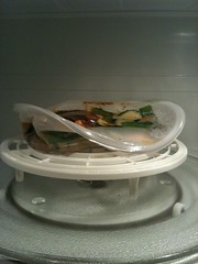
My microwave melted my FreshDirect microwave-ready meal

This is FreshDirect's SMART & SIMPLE MOROCCAN CHICKEN W/ HERBED COUSCOUS.

The instructions read, "Place in microwave and heat on high for 3 minutes in 1,000-watt or higher microwave." So I did, in my 1,000-watt GE Profile microwave. Three minutes later, this is what resulted.

The last step on the FD package--"Enjoy!"--is looking mighty difficult.

This is what the package looked like beforehand:

freshdirectmeal.png

The next Apple gadget

From my post on aiaio:
[The Apple] tablet's pixels per inch will be impressively high, like the 160 ppi of the iPhone. Most Mac desktop and laptop displays hover around 110 ppi. An 11" screen at 160 ppi will provide almost the same amount of pixel real estate as a 13.3" MacBook screen does now. This will help minimize people's perception that they're giving up detail for size.
Apple wants an iPhone in your pocket, an iSlate (or whatever) on your coffee table, and an iMac on your desk, with laptops positioned for students and the mobile workforce. It's ambitious. And more than a little smart.

January 4, 2010

links for 2010-01-04

Relatively knee-jerk reactions to my new iPhone 3GS compared to my old, original iPhone after roughly 39 hours of ownership

My new iPhone is much faster. Every function performs better, from finding wifi to launching apps.

The iPhone 3GS feels noticeably lighter than the first-gen phone, despite their officially weighing the same in grams.

According to my wife, people calling my phone can now hear me clearly, as opposed to my old one, which had developed awful reception and sound quality. On my end calls are less crunchy but not entirely different.

The warmer white point makes everything look irresponsibly yellow. I feel like my phone is jaundiced.

The ringer/vibrate button is in higher relief than on the old phone, and every time I put it in my pocket, the ringer turns back on. I hope my soon-to-arrive case will mitigate this effect. (Also: the AT&T Wireless store charged me $10 more than the manufacturer's website pricing for the aforementioned case. Rude.)

I am now keeping up with the joneses... until July, when the iPhone 3GT or whatever makes me instantly out of date.

January 3, 2010

The year in cities 2009

For the fifth year in a row I'm chronicling in this space the cities where I spent time in the past year. Per Jason Kottke's rules only overnights are listed; repeat visits are denoted with an asterisk. I've also put a dagger next to cities that I've visited in years past--to date, I only starred cities where I stayed twice in the same year.

New York, NY *† (home base)
Miami Beach, FL †
Puerto Moreles, Mexico
Livingston, NJ *†
New City, NY *†
Arlington, VA *
Boston, MA
Gloucester, MA
Madison, WI *
Hawley, PA
Edgartown, MA †
West Tisbury, MA
Milwaukee, WI
Chicago, IL †
Palm Beach Gardens, FL †

Interestingly, despite many trips to Massachusetts, I don't recall having specifically stayed overnight in Gloucester or Boston before this year. And the rest of those daggers suggest I'm quite the creature of habit.